Tuesday, April 3, 2012

Population Profile

Population profile maps are similar to scatterplots in that they both take information that is conveyed through the horizontal and vertical axis. The difference is that while a scatterplot uses dots, population profiles use bars. In this image, the horizontal axis shows the population in thousands, while the vertical axis shows the age in years. The ultimate goal of the graph is to show those with and without AIDS.

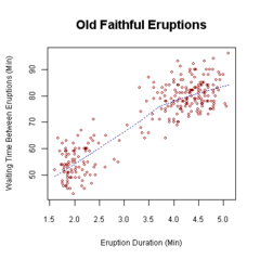
Scatterplot

Scatterplots are a type of math diagram that portrays two different sets of data. The data is displayed through points, with one set of information on the horizontal axis and the other set of information on the vertical axis. The image above shows what a scatterplot looks like. On the horizontal axis, it demonstrates the eruption duration time, while on the vertical axis it shows the waiting time between eruptions of Old Faithful. 

Index Value Plot

The Index Value Plot is commonly used to measure daily stock values. In the picture above, an inflation adjusted stock price index in India is seen from 1965-2008. When maps such as this are used, it can be slightly difficult to read, especially if it accumulates a lot of information throughout a long period of time.

Accumulative Line Graph

An accumulative line graph shows a set of data on a single line. Since it is cumulative it shows the information from the entire time period. This line graph shows the different defects and their percentages.

Bilateral Graph

This is an example of a bilateral graph. Sometimes information will be shown in positive or negative ways, or even represented in two different graphs. These graphs illustrate two different sets of data onto one line. 

Nominal Area Choropleth Map

This map represents a nominal area choropleth map. The values here are calculated for area and show a series of discrete values. These units are conveyed through the use of colors. Typically the darker the color the more of a particular value the area has.

Unstandardized Choropleth Map

 The image above is a great display of an unstandardized choropleth map. This type of map usually conveys statical data for large regions or countries. This map shows the percent change in population by each state in America. It is interesting to see that Florida is at the United States average.